
6 tips to increase product feature adoption
Discover how cognitive biases can influence how users adopt or reject new product features.
Your product has improved. You’ve captured and listened to the voice of your customers, and you’ve spent months developing features that some of your most loyal users have requested for a long time.
But when you actually calculate your feature adoption rate, you notice that the percentage is less than you’d hoped.
Why?
Feature adoption requires users to change the way they make sense of your product. This requires an extra amount of cognitive effort — something humans are already less likely to expend without good reason.
Therefore, it’s important for companies to make this process as seamless as possible.
This article shares some recommendations to consider when launching a new product feature, according to psychology.
How to increase feature adoption
Tip 1: Make sure your feature announcements are persona-targeted
Not all users are the same. Even though your new features may benefit your entire user base, certain features will inevitably be more relevant to some than others. For example, if a feature gives department heads a better overview of their teams’ activities, then your feature announcement should be tailored to this persona. What should be avoided is communicating to all users with the same message, as this is unlikely to improve adoption rates.
Consider the perspective of the target user. If the feature you’re releasing is a major one, does your feature announcement equip them with enough knowledge to make an effective and compelling case to other employees? After all, the use of B2B products is rarely an individual’s decision; according to Gartner, a typical B2B ‘buying centre’ involves six to ten decision makers — it’s likely that the same people are also involved even after the purchase. Providing the target user with an appropriate amount of information could help them counter the ambiguity effect, which refers to a tendency to favour clarity and certainty. One way to announce a major feature might be through a long-form blog post (whereas if the change is minor, you may consider emails instead).
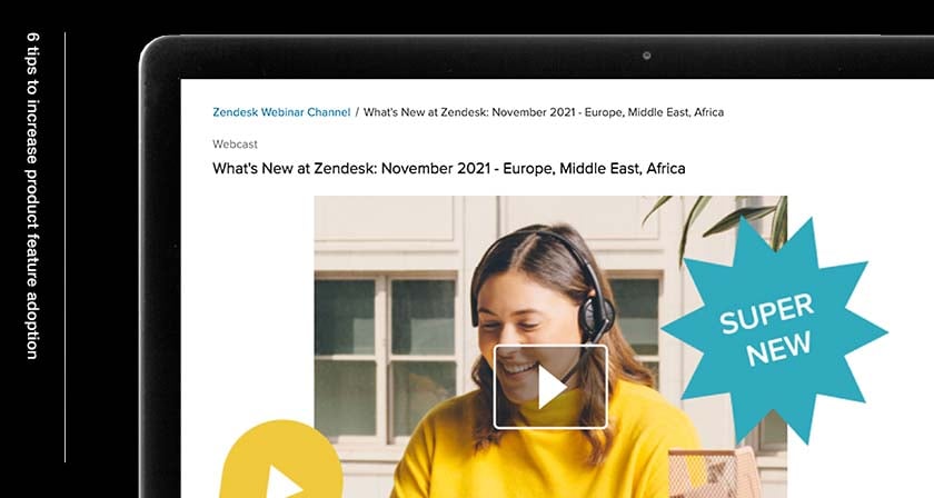
Example: Zendesk
Customer service SaaS company Zendesk constantly releases new features for all of their users. However, the company does not announce them to everyone in the same way. Even though they regularly update their blog with monthly updates for the more casual users, they also host quarterly ‘What’s New’ webinars for power users who use the more advanced features of their software. Because they’re likely to have stronger preferences on how they should navigate the platform, creating opportunities where Zendesk can expertly answer users’ questions greatly minimises friction.
Tip 2: Gradually introduce the feature to minimise momentum behaviour
Your new feature may provide users with a more efficient path to achieve a specific goal on your software, so it might seem perplexing if your analytics suggest that most of them stick to more cumbersome processes. It’s likely that this is due to momentum behaviour (also known as commitment bias). Generally, this refers to our predisposition to favour an option we’ve already committed to over an often better alternative. When B2B software users intuitively select a preferred way to accomplish a task, it is difficult to change their minds especially if they believe the act of learning better ways could affect their productivity as an employee.
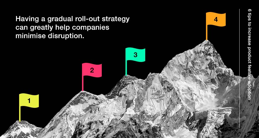
One way to minimise the chances of this happening is to avoid promoting your feature to everyone at once. New users are more likely to embrace new features, so a quick announcement is much more likely to work with them. However, long-time loyal users of your software are especially prone to momentum behaviour. Having a gradual communications strategy can greatly help companies minimise disruption by ‘warming’ long-time users up to new features.
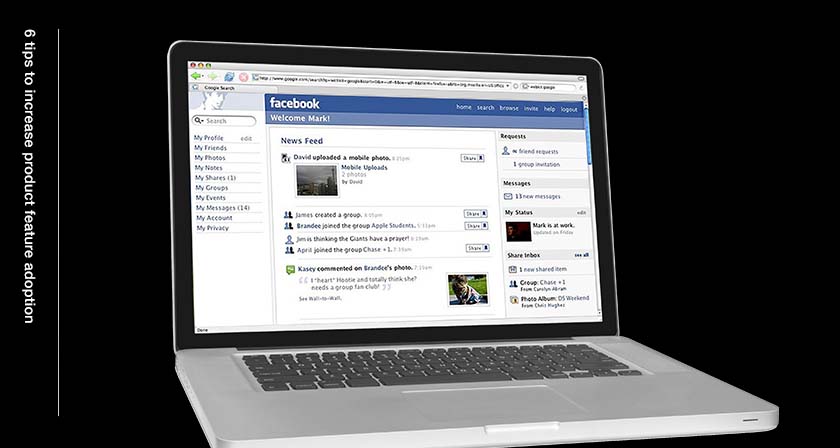
Example: Facebook’s News Feed
A controversial example of momentum behaviour is when Facebook introduced the News Feed in September 2006. Before, users of the then-emerging social media site had to visit individual profiles to see what that particular person has posted. It was no surprise that there was subsequent uproar when Facebook created a new centralised, algorithm-led feed on everyone’s Home Page. By drastically changing the user experience with much notice, the company clumsily disrupted people’s momentum behaviour (funnily enough, Facebook-style news feeds are widely accepted now!).
Tip 3: Highlight the cost of not adopting the feature
If your software is already functional and beneficial to your users to some extent, it may be hard for them to see the need to adopt new features. This is a common phenomenon known as loss aversion, which means the tendency to avoid losses and disadvantages more strongly than acquiring equivalent gains.
In order to help users overcome this, it’s important to highlight the actual cost of doing nothing, which should ideally be higher than their perceived cost of adopting the new feature. Giving users a clear understanding of what they might miss out on is an effective way to push them to desired outcomes. For example, you might recognise that your current software is saving users less time or money to accomplish certain tasks than desired.
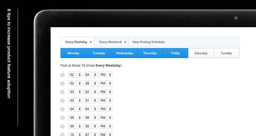
Example: Buffer
Loss aversion is commonly used by SaaS companies with a freemium pricing model. To offer an example, in 2015 social media management platform Buffer launched a highly-requested feature: Pinterest sharing. This was only available for users with paid plans, yet they gave free users a chance to try the feature so they would feel loss aversion when they were reminded via email that their trials were ending.
Tip 4: Make the feature the default (if changes are minimal)
Many times, new features are often major and important, requiring extra careful consideration of how it will impact the user experience. However, if you are introducing valuable but less significant changes, one way to increase feature adoption rates would be to simply make the feature the default option. This can work by leveraging your users’ innate desire to take the path of least resistance. In psychology, this is known as the ‘default effect’ — a term that is often used to explain why people are more likely to stay within a group if they’ve already been automatically included in it (as opposed to switching to a different group). The same idea applies to UX design. By making a certain feature the ‘natural’ option, you can save users from the cognitive effort of weighing up the pros and cons. Doing this, however, means you should proceed with caution as there is always a performance risk when it comes to changing how people experience your product. A way to mitigate this risk is to introduce the change to a test group first and evaluate results before rolling it out to the wider public.
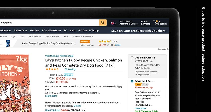
Example: Amazon’s Subscribe & Save
A popular example of the default effect in action is Amazon’s introduction of Subscribe & Save in 2007. For eligible products, this feature is the default choice for shoppers looking to make a purchase. If you don’t want to get a specific product on a rolling basis, you have to ‘opt out’ and choose the ‘one-time purchase’ option instead. Doing this takes extra cognitive effort, so some people will continue to use the Subscribe & Save feature as a result.
Tip 5: Give users a confident framework of reference
Another effective way to encourage feature adoption is to give users a framework of reference. As humans, we constantly think in frames. Relying on existing information helps us understand new information faster. When introducing unfamiliar features, it can be helpful to give users an idea of how they compare to existing features out there on the market. If your new feature is similar to what your competitors already offer, you might want to think about your points of parity and difference — then highlight the most significant difference. For instance, your feature might help users organise data more easily, but unlike your competitors’ software, it does so much faster.
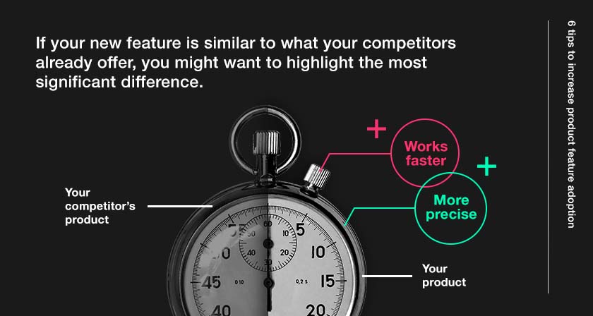
When you’re giving users a framework of reference, it’s essential that you emphasise what they will gain, instead of what they could gain. This is due to the framing effect, which suggests that because people are much more likely to act on sure gains over probabilistic gains.
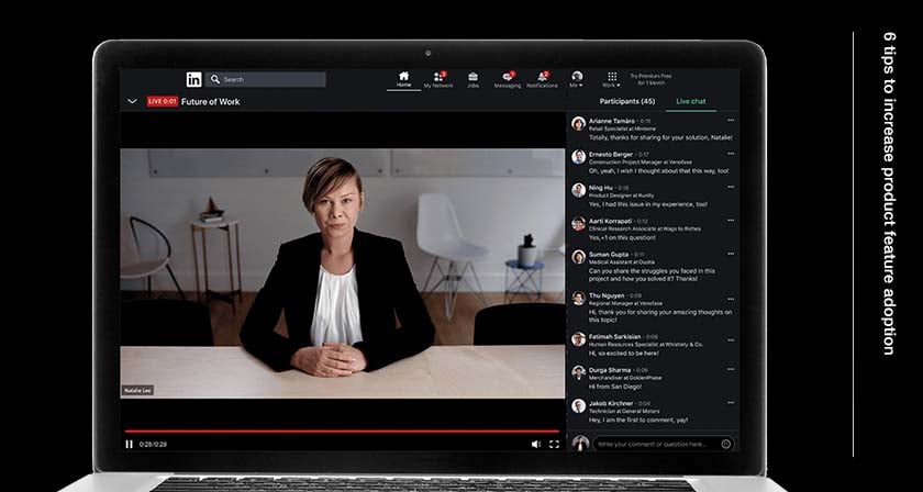
Example: LinkedIn
LinkedIn has long positioned themselves as the world’s largest social media network for professionals. Even though the platform itself is relatively similar to its counterparts in terms of functionality, its most significant point of difference is the fact that it’s intended for professional networking. This makes it very easy for LinkedIn to meaningfully replicate features from other social networks, as they can confidently promote a simple and easily understandable framework of reference (‘this feature is like X, but for professionals’). In fact, it’s been reported that the company is set to launch Clubhouse-style audio rooms this year. To existing LinkedIn users, this is likely to be perceived as a sure gain.
Tip 6: Make a rational and emotional case for change
PwC’s report on change management makes it clear that in order to convince users that a new feature is worth their time, a rational and emotional case must be made together. Using facts will prove to be a valuable tool (especially if the user needs stakeholder approval to adopt the feature). However, your messaging should also remind users that they have played an essential part in the development and release of the feature. This makes adoption more likely, for two reasons. Firstly, people tend to feel more attached to ideas they were involved in (feedback loops like these are easily created by customer-orientated companies that regularly capture the ‘voice of the customer’). Secondly, according to the ABC Model of Attitudes—a popular theoretical framework—cognition (thoughts) and affection (feelings) are closely followed by behaviour. Therefore, appealing to users’ rational and emotional sides can be an effective way to bring about action.
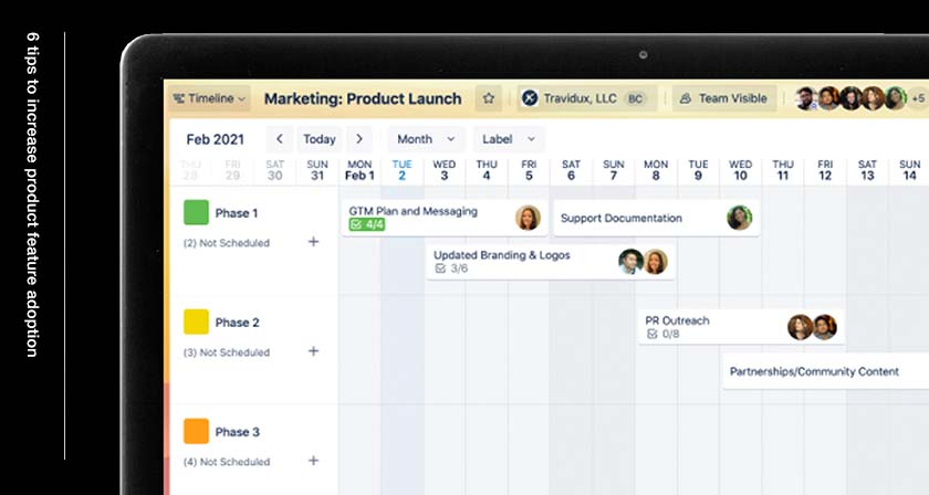
Example: Trello
In 2021, web-based project management software company Trello announced a big overhaul—this meant new features that would modify how users navigate the platform. Their blog post includes a detailed deep dive into all the technical changes. Yet, the announcement also appeals to their users’ emotions by framing the overhaul as a celebration of their project accomplishments over the past decade—and the significant role they played in the development of Trello’s new era.
Conclusion
Launching and promoting a new product feature with cognitive biases in mind is key to ensuring higher adoption rates. By making sure that users’ first encounters with the feature are appropriately timed and managed, companies can deliver value more seamlessly without unnecessary complications or resistance.

Pete is a strategic marketing leader specialising in positioning, go-to-market strategy, growth and AI-enabled marketing performance. He has worked with organisations including Schneider Electric, TechData, Atos, Microsoft, Reachdesk, ABB, TelmarHelixa, Trustpilot, Company365, GlobalData and more, helping brands sharpen their market position, strengthen go-to-market execution and accelerate growth.
His work focuses on turning complex propositions into clear market narratives, aligning commercial teams around stronger positioning and improving marketing performance through the smart application of AI. From category development and messaging to launch strategy and growth planning, Pete brings a practical, commercially grounded perspective shaped by hands-on experience across B2B and enterprise environments.
Pete has also spoken at Content Marketing World, where he has contributed to industry conversations on positioning, growth and the changing role of AI in modern marketing. He writes about the strategies, decisions and operating models that help ambitious brands move faster, communicate more clearly and perform more effectively.
Read the latest positioning trends and insights.
Tap into our brand and product positioning, storytelling, and creative expertise to inspire your next strategic move.

